
Introducing School Atlas:
A Map of Every Rated Ontario School
A free map of every Ontario school we rate, four-year trends, and what a rating actually tells you about a neighbourhood.
School ratings aren’t really about schools.
When we line up our ratings for 4,299 Ontario schools against the demographics of the neighbourhoods around them, the pattern is clean. Higher-rated schools sit in neighbourhoods with higher adult education levels, higher employment, higher household incomes, and lower crime rates. A school rating doesn’t measure any of these things directly — but it ends up tracking them all.
Which is to say: a school rating is a usable proxy for “is this a strong place to raise a family?” — and it’s the only such signal we know of that’s free, fresh, and comparable across every school in the province.
The same pattern shows up cleanly in home prices. A detached house within walking distance of a Toronto school we rate 8+ has a median list price of $1.94 million. The same kind of house near a school rated 5 or below: $1.14 million. Same property type, same city.
A rating that tells you this much about a place to live should be one of the easiest things to look up. It isn’t.
There’s no convenient way to explore Ontario school data with current numbers. The best-known reference, Fraser Institute’s annual report, sits behind a dated website with awkward usability and data that’s a year stale. Parents explore by area, by city, over time, long before they’re ready to buy. They needed a tool.
We built School Atlas at schoolatlas.ca.
What a rating reflects
To test that out, we matched 662 Toronto schools to their City of Toronto Neighbourhood Profile (Census 2021) and grouped them by RealHunt rating. Four indicators — median household income, the share of adults with a bachelor’s degree, the share of households in low income, and the employment rate — climb (or, for low income, fall) with the school rating, monotonically across every bucket.
The same kind of bucketing works on home prices, and the gap widens. A detached house near a top-rated Toronto school has a median list price about 70% higher than the same kind of house near a low-rated one — and the ladder holds inside semi-detacheds, townhouses, and condo apartments too.
A note on causation: schools don’t cause high incomes or high home prices. They’re all downstream of the same thing — educated, stable, employed neighbourhoods produce both strong test scores and strong housing demand. The rating is just the most lookable signal of the bundle.
The ratings themselves are our own. EQAO publishes the raw Ontario test results; we build our scoring on top of them with a proprietary statistical methodology — separate Math and Literacy components, different weighting choices than other published rankings, year-over-year standardization, and edge-case handling for small schools. The full methodology is in two prior posts: elementary and secondary.
What parents actually do
When we watched what parents do with school data — friends, neighbours, our own family — we kept seeing the same four jobs, performed in order, often weeks or months apart:
- “Which areas are strong?” Exploratory, before they’ve picked a city or neighbourhood. Geographic.
- “Of all the schools in this city, which are the shortlist?” Narrowing. Tabular.
- “Is this one school really good, or did it just have a lucky year?” Drilling in. Detailed.
- “Great. What homes are near it?” Bridging to real estate.
School Atlas is built around all four. Here’s how each one shows up.
The heatmap: which areas are strong?
The front page of School Atlas is a map of Ontario tiled with hexagonal cells. Each hex is coloured by the average rating of the schools inside it — red for low, green for high, transparent where there’s no rated school in the active filter. Zoom in, the hexes get smaller. Zoom further, they break apart entirely and individual schools appear as marker pins, each one clickable.
That shift from “school” to “area” is the whole point. Instead of looking up a single school’s score, you see a pattern: south Burlington is dense with strong schools; St. Catharines has a striking concentration of high ratings; certain pockets of the GTA stand out at a glance. The question stops being “what does this one school score?” and starts being “where should we live?” — which matches how parents actually think.
Filters update the map live. Toggle between Elementary, Secondary, or Both. Switch to Public or Catholic. Filter by English or French. Set a minimum rating of 7+. The hexes recolour, the marker pins update, no reload, no waiting.
And given what a school rating reflects — incomes, education, employment — the heatmap doubles as a rough map of which Ontario neighbourhoods are strong overall.

City pages: what are my options here?
Once parents have narrowed to a city, they want the shortlist. Every major Ontario city has its own page on School Atlas — Burlington, Oakville, Toronto, and so on — with a sortable table of every school in that city alongside a hero map. Name, overall rating, math rating, literacy rating, type. Sort any column. Switch between Elementary and Secondary at the top.
That “sort by Math” or “sort by Literacy” feature isn’t decoration. It lets parents weight subjects by what matters for their kid. A family choosing a strong STEM environment ranks differently from one prioritizing reading and writing — and we built our ratings to break those out separately, so the city table can put either at the top.

School detail: is this real or just a lucky year?
Every school gets its own page on School Atlas with our three rating gauges — Overall, Math, Literacy — and the chart that matters most: a four-year trend showing 2021–22 through 2024–25.
Single-year ratings can mislead. A school with one great year and one weak year is different from one that’s steadily 8+.
Look at Rosedale Jr PS. A real dip in 2023–24 (overall rating 7.1, down from 8.8 the year before), and a clear recovery in 2024–25 (8.9). Fraser’s January 2026 report still shows the 2023–24 dip and nothing else — they’re a year behind, so parents reading it now would see Rosedale as a school in decline. The four-year chart shows the recovery.

The rest of the school page is what you’d expect: address, phone, board, grades, language, a small location map, a list of nearby schools sorted by distance. The trend chart is the centerpiece.
Catchment listings: what homes are near it?
On every school’s detail page, we show a few active listings inside its catchment area, clickable through to the full listing on realhunt.ca. The full home search lives in our mobile app.

What you won’t find here
No ads. No signup. No email capture before you can see a rating. No “request a free home valuation” interstitial. If you’ve used a free tool aimed at homebuyers, you’ve probably hit all of these. School Atlas doesn’t have any of them — by design.
Trust comes from showing your work and getting out of the way.
What’s next
The same school-rating layer is coming to home search. Next month, realhunt.ca ships a full map-based listings search with the H3 heatmap and individual school ratings layered directly into the map — same data, same approach, integrated into where parents actually start looking for a home.
One account everywhere — what you save on the web is on your phone the moment you open it. Smarter search and recommendations across the app. Every feature traces back to a real client question. The next one we’re answering: making sure school exploration flows straight into the home search itself.
Census variables sourced from the City of Toronto Neighbourhood Profiles 2021. Contains information licensed under the Open Government Licence – Toronto.
Read Next

Ontario High School Ratings:
What the Data Shows
We rated 762 Ontario secondary schools using 2024-25 EQAO data. Fresh ratings with Math and Literacy breakdowns, board rankings, and geographic patterns.
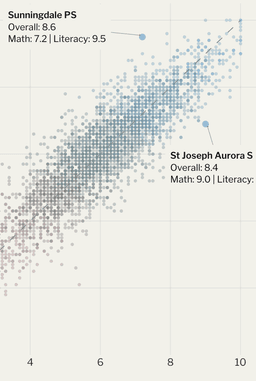
Why We Built Our Own
School Rating System
Existing ratings lag behind official data releases. We pull EQAO results directly to give you fresher, more detailed insights into Ontario elementary schools.
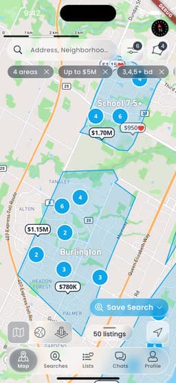
House Hunting Should Be Simple.
Most Apps Make It Complicated.
We built RealHunt to make home searching enjoyable and efficient — with native maps, smart alerts, transparent school ratings, and direct chat with the agent.